Case study: Redesign Pro Referral mobile app
01 / Background
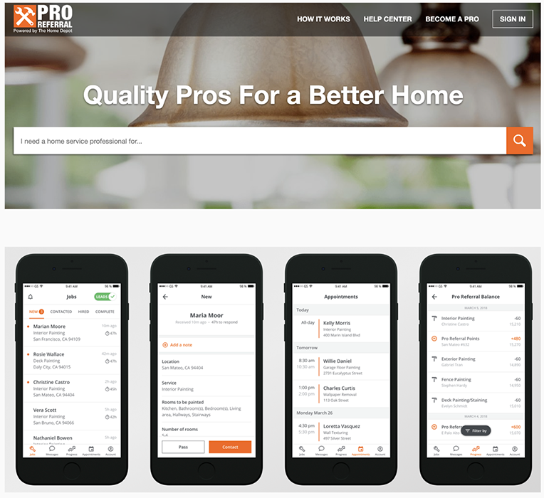
Pro Referral is Home Depot’s digital marketplace that connects licensed professionals (“pros”) with homeowner leads. The mobile app is the lead-gen tool pros use to receive and reply to leads, message customers, and manage jobs. Our task: boost engagement and brand loyalty for the most active pros.
02 / Problem framing: visibility
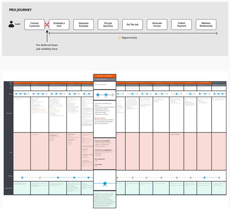
On the old app, we saw heavy churn at certain stages of a job. The reason: we lost visibility once a pro contacted a lead. Which meant we couldn’t:
- Know if a job was done
- Measure pro performance
- Drive product loyalty, retention, and in-store spend
- Improve lead quality
- Identify pain points in the app
- Reward high performers
- Connect leads with relevant, responsible pros
03 / Problem framing: pro feedback
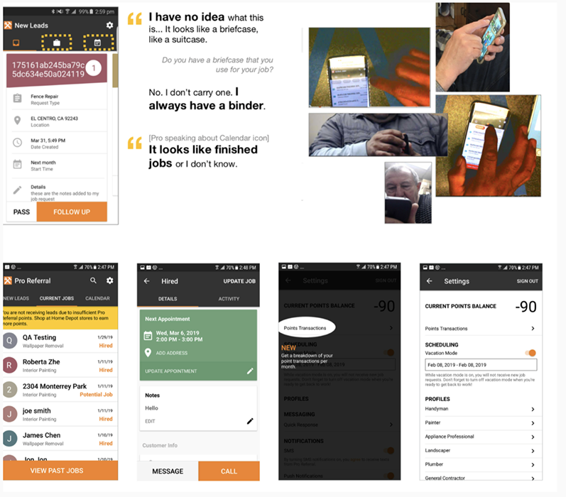
Thanks to our in-house researcher, we had key insights from pros who used the app daily:
- Confusing IA, can’t find things
- Low awareness of features
- Various usability issues
- Not perceived as pro-friendly
- Job statuses and timer don’t match the pro’s mental model
- Unclear, inconsistent copy
04 / My content design framework
To be successful, I built a content design framework grounded in one question:
How can content design help pros manage jobs from start to finish, in a way that speaks to them, while aligning copy across product, brand, and our team?
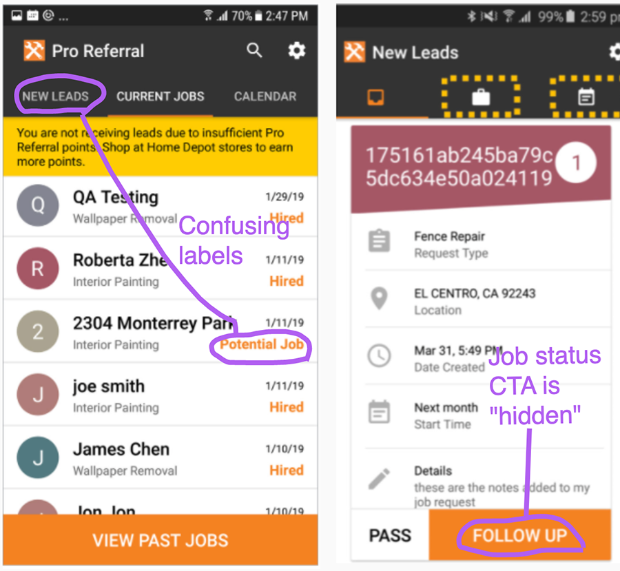
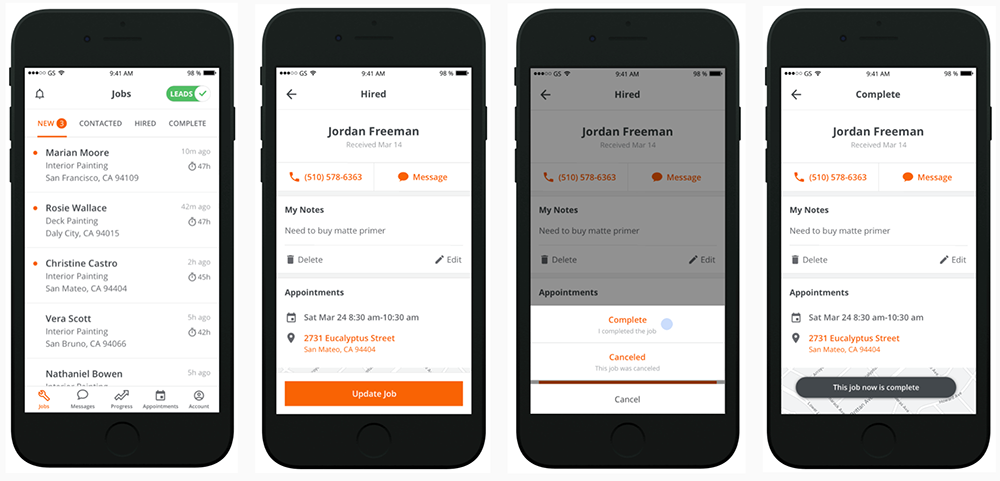
05 / Help pros manage jobs: IA and labels
The previous IA separated leads from jobs, which confused pros. The “update job status” link was hard to find.
I talked to pros to understand how they think about their work, going from lead to finished job. Then I:
- Simplified the job lifecycle to match the pro’s mental model
- Paired each backend match status to a pro-facing job status label
- Tested the new labels
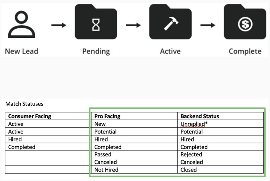
A clear labeling hierarchy and better UX created the steps pros needed to manage their jobs.
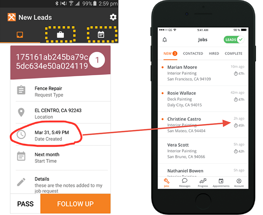
06 / Timestamp logic
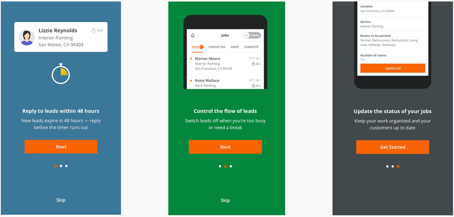
The term “New leads” conveyed zero urgency to follow up with the customer waiting for a reply and a bid. I rewrote the timestamp logic to clarify when a lead arrives and expires, using both absolute and relative time depending on context.
Even though pros compete for leads, our research uncovered something important: pros have pride. They don’t see themselves as the “beggar” in the customer relationship, but rather the “chooser.” The copy needed to honor that.
07 / Speak to them
To write the UI copy, I did more research, talked to subject matter experts, and built a comprehensive messaging strategy. New onboarding flow:
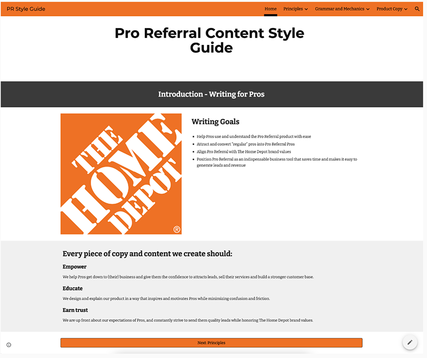
08 / Aligning copy across product, brand, and team
I created an HTML style guide for Pro Referral with the goal of empowering my team with UX copy that:
- Is reusable, scalable, and transferable
- Reinforces the Home Depot brand
- Provides clear direction and hand-off protocols for build partners
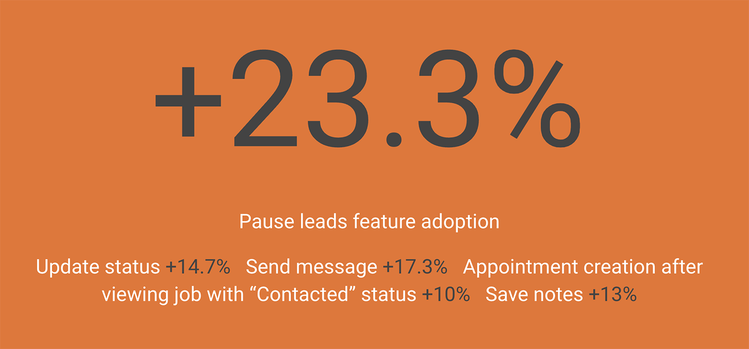
09 / Results